Wireframing to Structure User Experience

Purpose of Wireframing

Accordion Arrow

Understanding Users, Structuring Experiences

With over a decade of experience in digital design, I focus on crafting clear, intentional user journeys and detailed wireframes that align with both user needs and business objectives. My approach combines deep research with iterative design, ensuring each step of the journey is intuitive and engaging. Primarily working in Figma, Sketch, and occasionally Axure, I build wireframes that not only visualize user flow but also communicate the nuances of interaction and layout. These wireframes are structured to be easily scalable and adaptable as projects evolve, enabling a smooth transition to high-fidelity design and development phases.

Additionally, I’ve been working on internal design guideline pages. For example, this one is for the latest project and is still a work in progress: https://resources.sp-edge.com/product/design/design-home. I focus on their B2B product, and the marketing team gave me the opportunity to work on their Webflow page to add this internal page.

Flockx - Community Event Discovery App

Accordion Arrow

Flockx began with a completely different concept—as a parking swap app for users to find and share parking spots. Through iterative wireframing, we were able to rapidly explore and pivot business ideas, moving from the parking concept to a gig-worker marketplace similar to Uber’s super app, and finally to a community event discovery platform. Wireframes enabled us to test each concept quickly, align on goals, and make informed decisions at every stage, ultimately shaping Flockx into an app that connects users to local events and experiences.

2021-2022
floxx
Community Event Discovery App (iOS)
  • Gig worker app research: Including Angie's List, Uber, and Turo
  • MVP wireframes: Collaborated with marketing, engineering, and legal teams to define the executable design for the initial launch.
  • Business concept iterations: Through a series of wireframing exercises, the business model was rapidly tested and evolved into the current community event discovery app.
Wireframes were also used to analyze different projects, studying their solutions and flows.
Wireframes enable visualization of the entire user journey and facilitate communication across teams, from business to product.

WSJ - Rapid Testing Through Experimental Design

Accordion Arrow

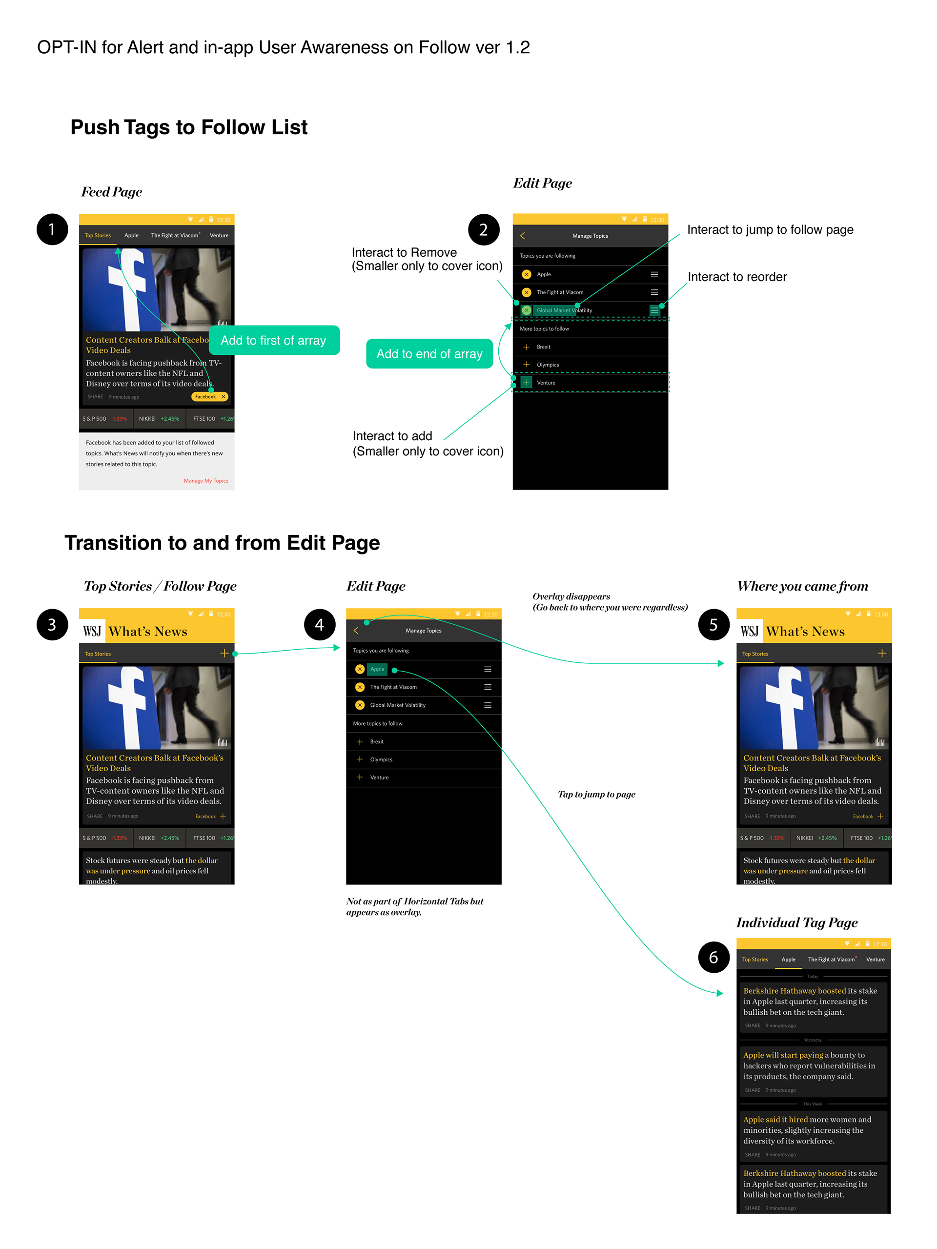
WSJ What’s News began as a streamlined version of The Wall Street Journal app, designed to rapidly test new features within a concise format. Wireframing allowed us to present early ideas directly to stakeholders and align on business objectives. As the lead designer, I translated complex concepts into clear visual guides, facilitating discussions with both business and editorial teams. This approach enabled us to quickly assess the viability of new components—such as video players, market charts, and AR features—before committing to full development.

2016 - 2018
Dow Jones
WSJ What's News (iOS, Android)
  • Material design adaptation: Aligning with Google's Material Design guidelines, collaborating with the company's partner team from Google.
  • Video player: Led the exploration of video player design options as WSJ expanded its video offerings.
  • Market center: Collaborated with editors from the financial department to explore revised design options aimed at enhancing the market charts and ticker management experience within the app.
Complex integrations of video players into the WSJ app were explored and tested through its experimental sister app.

Travel Booking Website

Accordion Arrow

Peach Aviation's web app concept was designed to simplify travel planning for budget-conscious users by enabling seamless destination discovery and upselling travel essentials. Through diagrammatic wireframes, I illustrated features like an intuitive calendar view to help users find affordable destinations based on their available dates and a single-page layout that integrated upsell options such as transportation, car rentals, and hotels. This approach emphasized a streamlined, user-centric experience, ensuring all aspects of the journey could be managed efficiently in one place.

2015
Peach Aviation
Strategist / UIUX Designer

Peach Aviation's booking platform was designed to help budget-conscious travelers discover and book flights, offering a fresh perspective to Japanese consumers in a market where the low-cost carrier concept was still new. As a product designer, I focused on creating an intuitive, user-friendly interface that addressed the diverse needs of travelers. Key features included innovative search options tailored to flexible students and time-sensitive business travelers, simplifying the process of finding and booking affordable flights.

teamLab was chosen to propose the booking site for Japan's first low-cost carrier (LCC) and made it to the final selection stage.
Various animations were created to explain key concepts from the wireframe. This illustrates a seamless page that maps out the traveler’s entire journey, offering upsells for various items, including seat assignments and rental cars, all within a single view—helping users easily visualize and secure everything they need for a comfortable trip.

Get in touch

I'm excited to learn about your project.
Let's collaborate to turn conceptual ideas into concrete results.