Logo Design

Say So
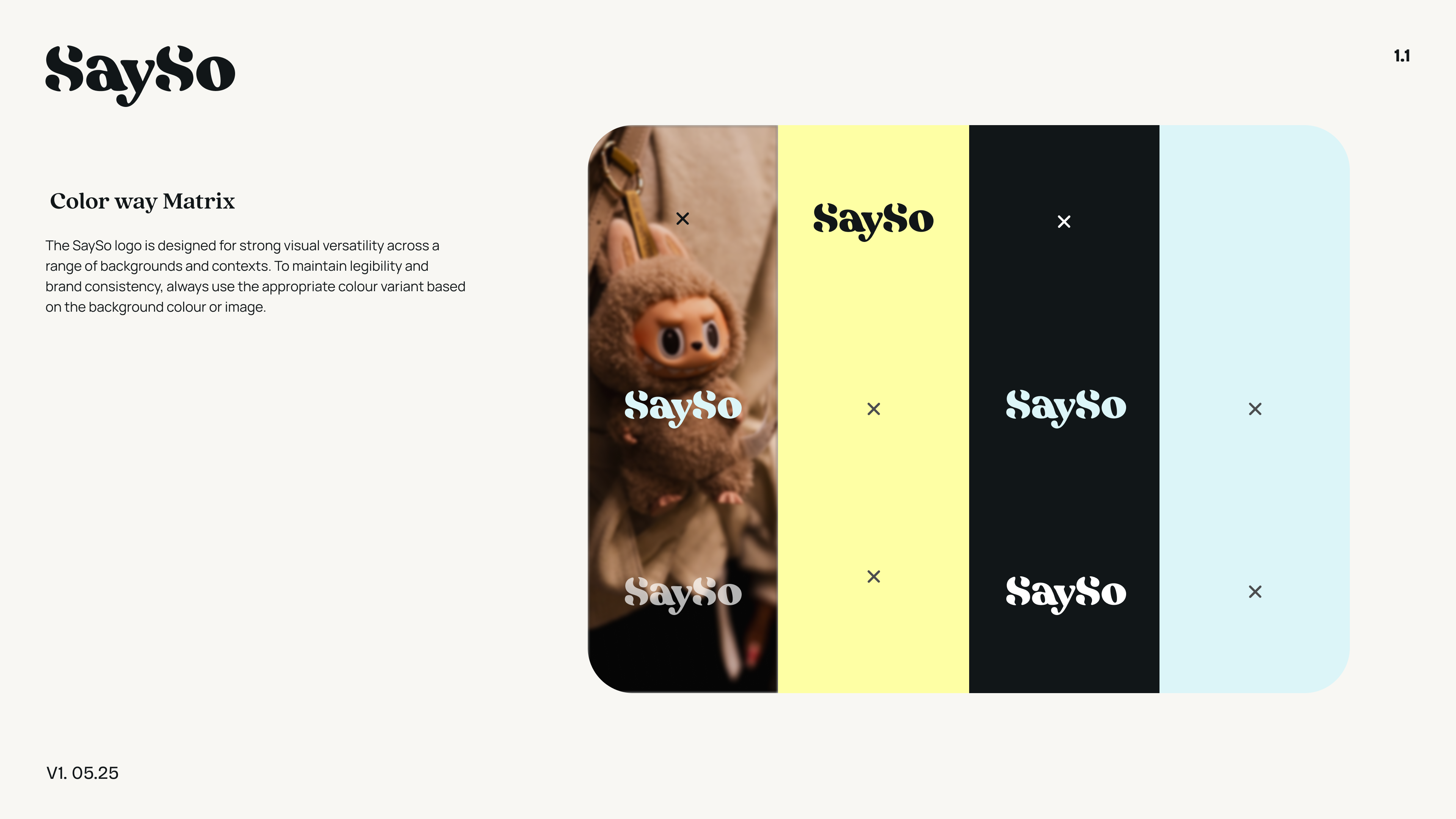
Say So is a new creator-driven news app from the media company Caliber, built around verified creators and stories grounded in strong sourcing. Backed by major media institutions like AP, it delivers clear, trustworthy news without the noise. Its brand identity reflects that mission: clean, credible, and human—positioning Say So as a modern guide through today’s overwhelming information landscape.
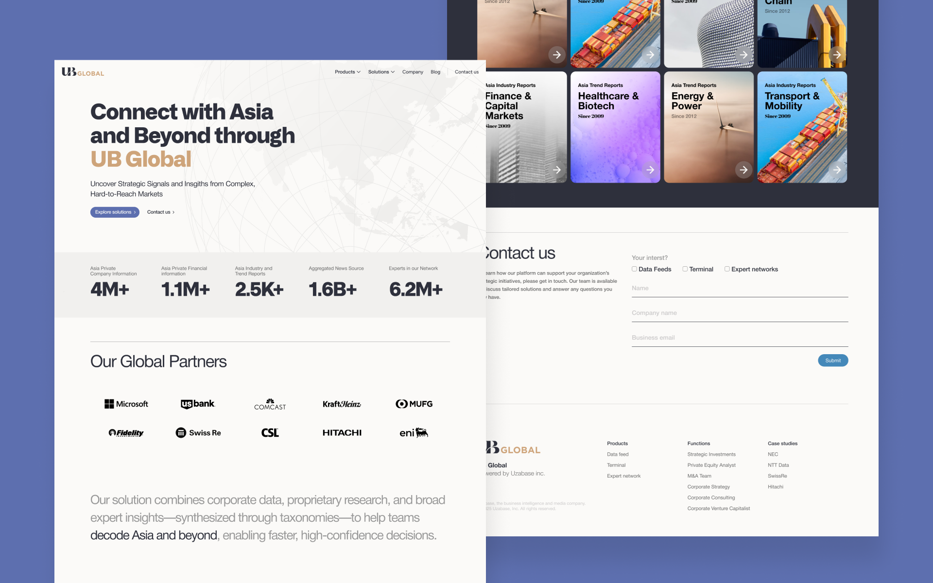
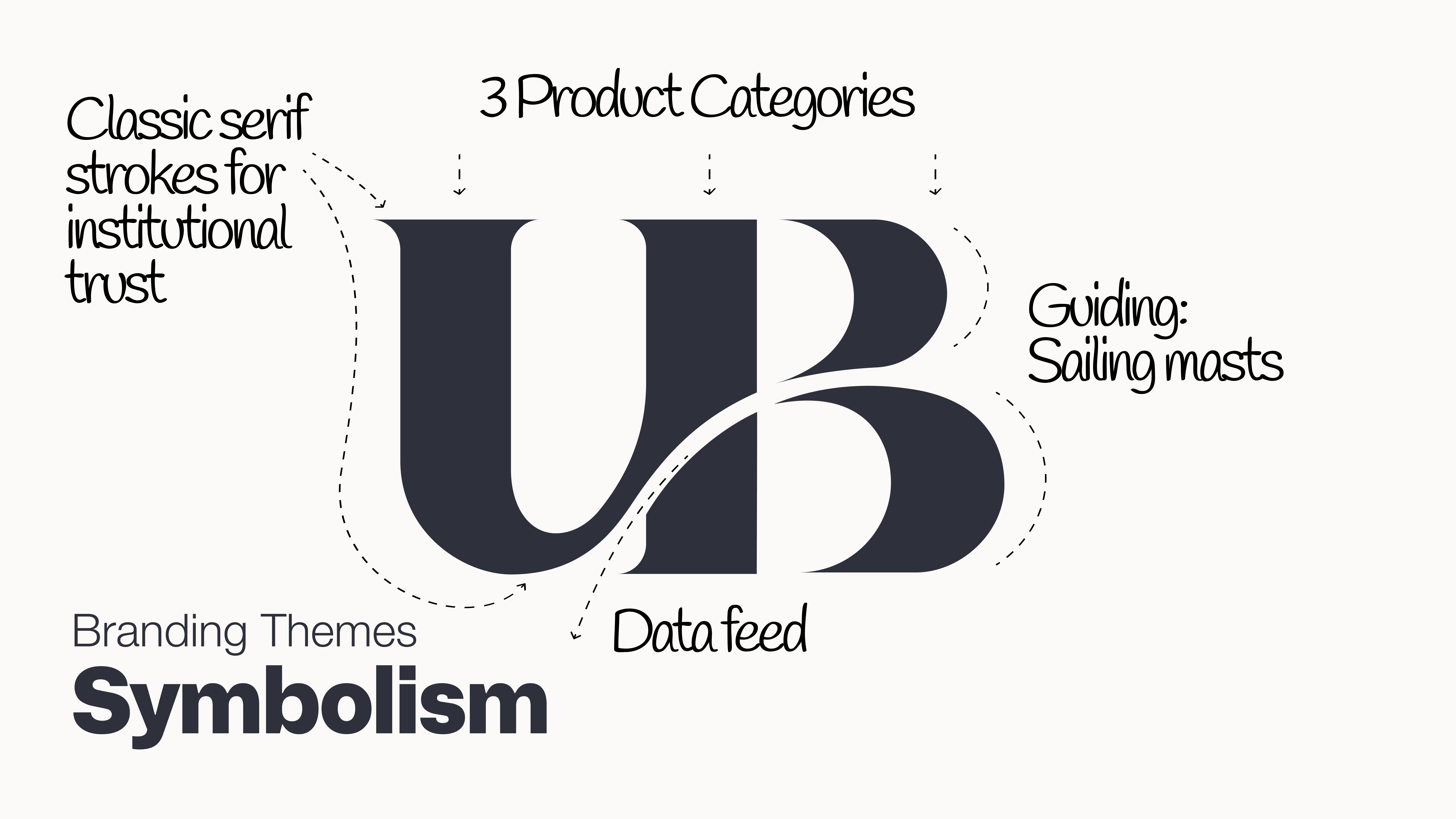
UB Global
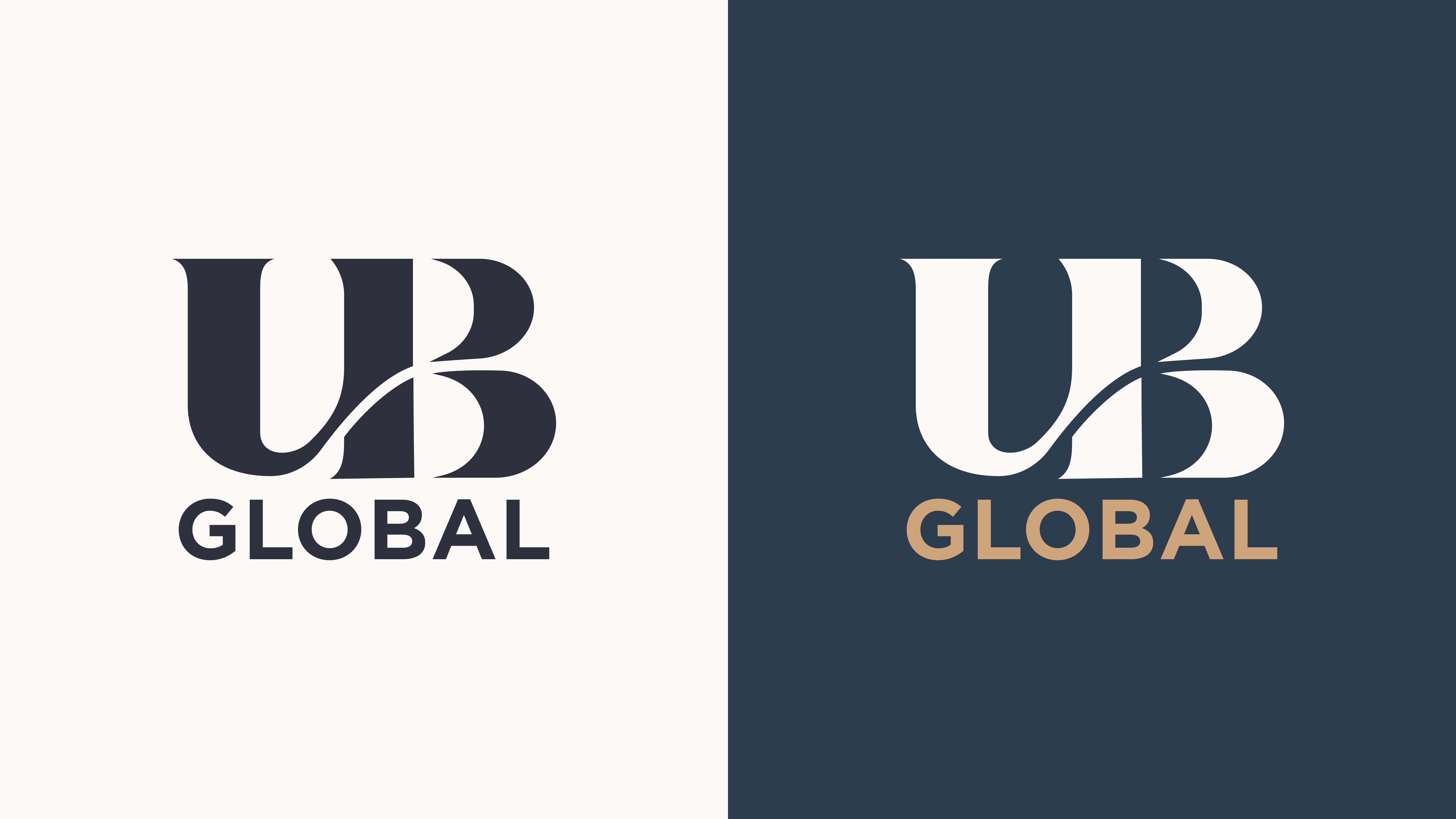
With Uzabase’s expansion beyond Asia, its key audience shifted from intra-Asia businesses to global institutions seeking insights into the often opaque markets of Asia. To reflect this shift, the brand was reimagined under the simplified name “UB,” chosen for its clarity and global recognizability.
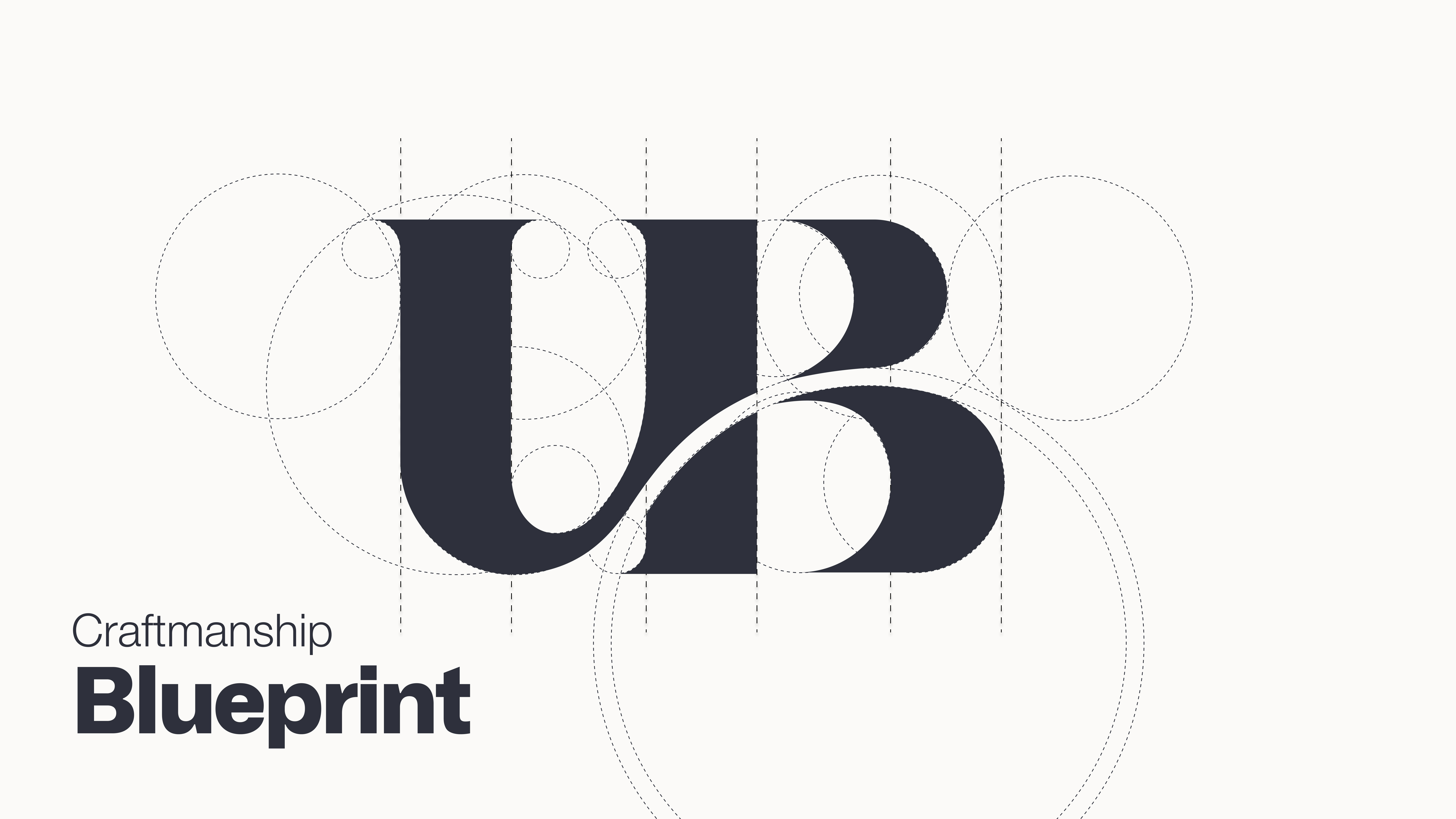
The logo was redesigned to project a more institutional tone suited to North American audiences, incorporating visual cues that reflect the brand’s new direction—positioning UB as a trusted guide through fragmented markets and signaling growth into new product categories. Drawing inspiration from typefaces commonly associated with institutional branding, the logo system was meticulously crafted and calibrated using strict geometric principles to ensure precision, balance, and consistency.
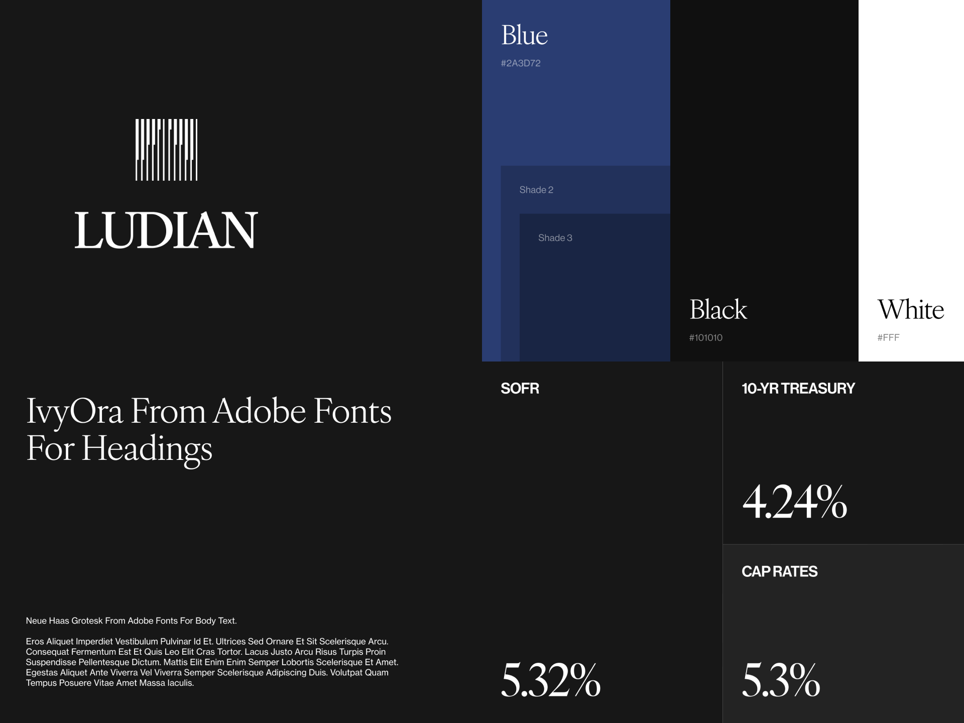
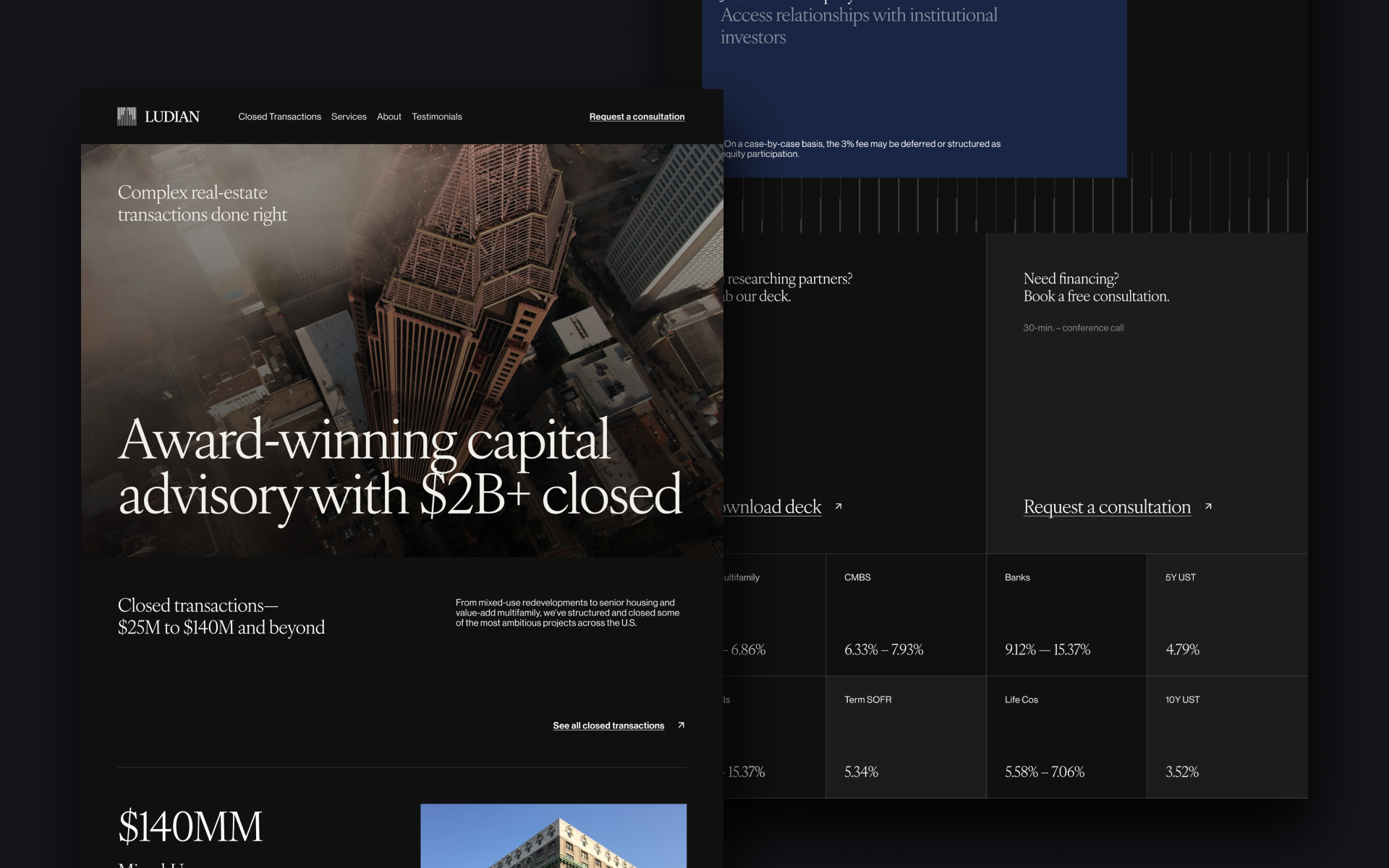
Ludian Advisor
With the launch of Ludian Advisors, the priority was to establish a brand identity that communicated credibility, stability, and professionalism within the financial advisory space. The logo was designed to project trust and refinement, drawing inspiration from modern serif and sans-serif typefaces often associated with institutional brands. Careful attention was given to proportion and geometry, ensuring the mark conveyed both authority and approachability.