Aerscape — Designing an Accessible Color System for Data-Dense Visualizations

Why

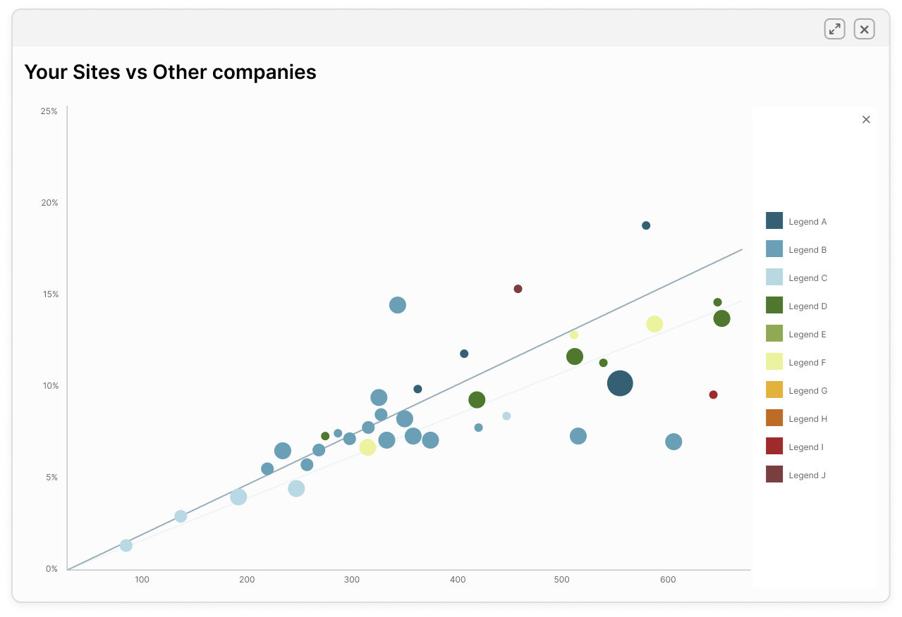
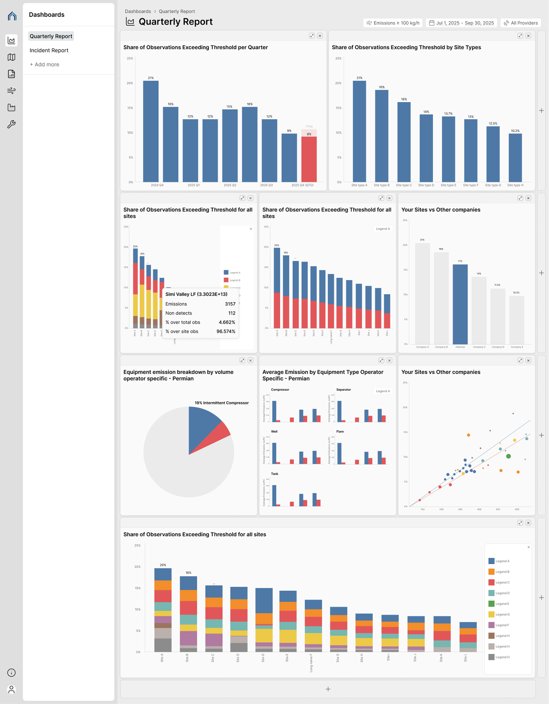
As the platform scaled, operators were comparing 8–10 entities at once — especially in scatter plots and time-series views — and color started to break down as a reliable differentiator. Existing color usage did not scale well under density, overlap, or color-vision deficiencies, increasing the risk of misinterpretation. Improving color differentiation became critical for scanability, accessibility, and decision-making in high-stakes compliance workflows.

What

I developed a 10-color system specifically for dense comparisons — where multiple entities appear simultaneously and color carries most of the cognitive load. The system balances accessibility, brand expression, and perceptual clarity—ensuring colors remain distinguishable across scatter plots, bar charts, and historical views, even at small sizes or under color-blind conditions.

How

Key focus areas included:

  1. Perceptual Differentiation — Early tests showed that hue differences alone failed quickly when points overlapped or shrank, which shifted the strategy toward luminance and saturation contrast.
  2. Accessibility Validation — Tested color combinations across common color-vision deficiencies and adjusted luminance curves accordingly.
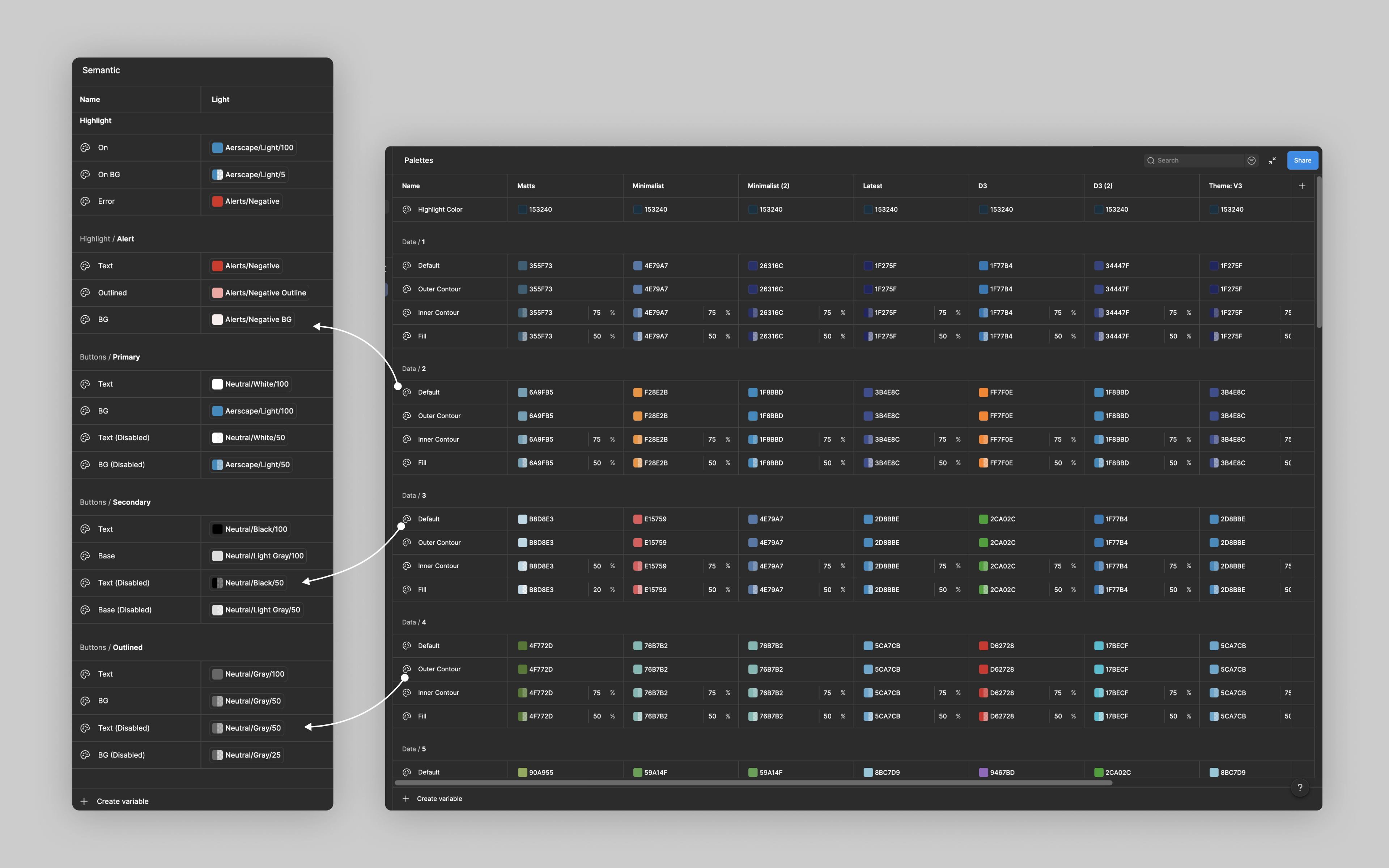
  3. Systemized Implementation — Defined semantic color tokens and implemented them in Figma using variables and components, enabling consistent usage and scalable updates across the product.

Project Context

Accordion Arrow
Context

Compony

Aerscape

Title

Principle Product Designer

Role

Led the design of a scalable data-visualization color system, balancing accessibility, brand expression, and usability for dense, multi-variable charts. Owned problem definition, visual system design, accessibility validation, and Figma-based implementation with engineering.

Project type

Design system for an existing B2B SaaS platform

Duration

~2 months design, ~5 months phased development. Foundational exploration and experimentation occurred prior to formal project kickoff

Product overview

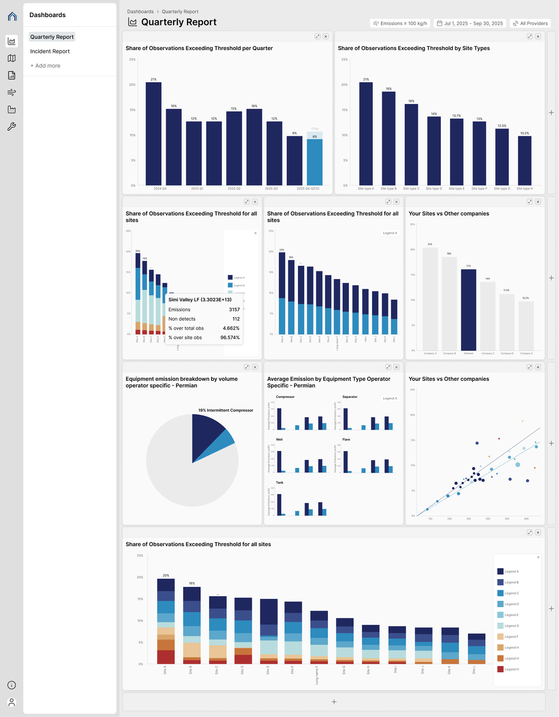
Aerscape is a data-heavy B2B platform that helps operators and compliance teams monitor emissions, performance, and regulatory risk across industrial and energy sites.

A core challenge of the product was making complex, multi-variable data scannable at a glance—while maintaining accessibility for color-vision deficiencies and preserving a cohesive, credible brand identity. This project focused on designing a 10-color data visualization system that performs reliably across scatter plots, line charts, and bar charts, even under dense and overlapping conditions.

Target audience

Aerscape is used by operators, analysts, compliance teams, and site or field managers at large industrial, oil & gas, and energy organizations. Depending on role, users monitor data at different scales—from site-level views to regional or national dashboards—and at different frequencies, ranging from real-time monitoring to longitudinal trend analysis across hundreds of assets in the US.
The Challenge

Accordion Arrow

1. Accessibility vs. Brand Expression

Regulatory dashboards are traditionally grayscale or utilitarian.

Aerscape needed a distinct visual identity while still meeting accessibility standards.

Color alone could not be the only differentiator, but it still needed to carry meaning.

2. Dense Visualizations

Scatter plots often display 8–10 overlapping entities.

Colors must remain distinguishable even when points overlap or appear at small sizes.

Unlike bar charts, scatter plots lack strong positional or ordering cues.

3. Color‑Vision Deficiency (CVD)

Red–green confusion is common.

Blue–purple and green–brown collisions occur frequently in dense charts.

We needed differentiation that survives deuteranopia, protanopia, and tritanopia simulations.

The 10‑Color System

Accordion Arrow

Why 10?

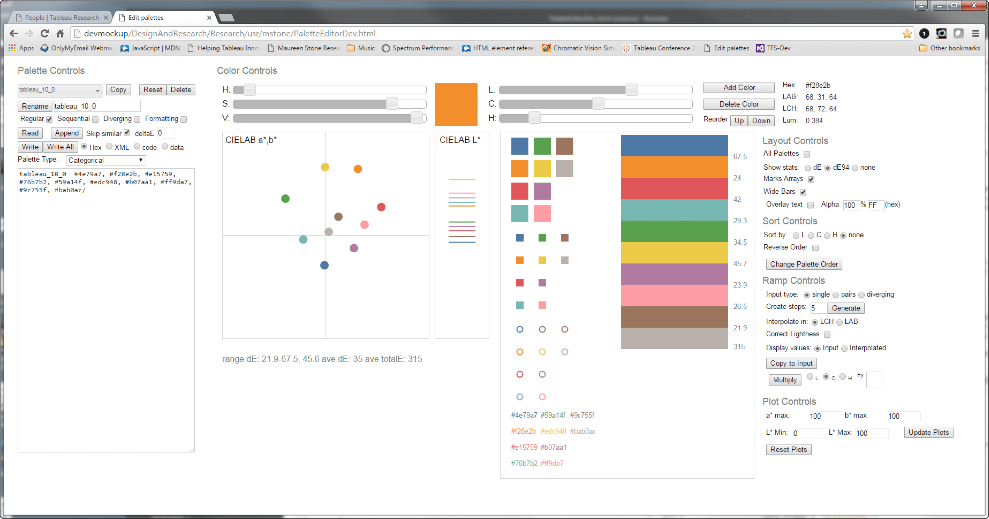
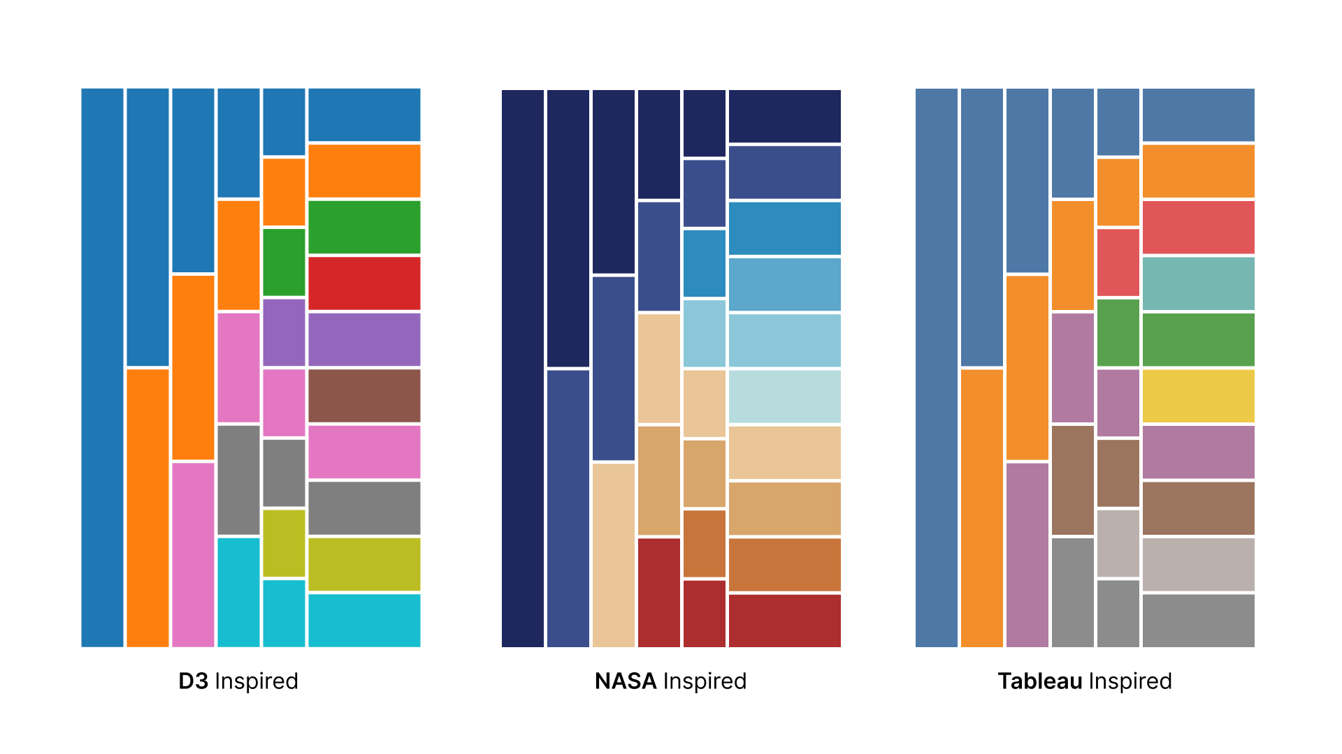
Most well-established data-visualization systems deliberately cap categorical color palettes. For example, Tableau’s categorical palette effectively supports up to 10 distinct colors, D3’s schemeCategory10 is explicitly designed around 10 categories, and ColorBrewer recommends limiting qualitative schemes to roughly 8–12 colors before perceptual differentiation begins to break down—particularly for users with color-vision deficiencies.

In Aerscape’s case, the decision to cap the system at 10 colors was not arbitrary. Looking at existing datasets and the near-term roadmap, we saw that users rarely needed to compare more than 10 entities at once. Designing beyond that added complexity without improving real workflows. Designing beyond that threshold would have increased cognitive load and accessibility risk without delivering meaningful practical value.

By setting a clear and defensible ceiling, we were able to focus on maximizing perceptual distance, accessibility, and consistency within the range that mattered most to users.

Reference: Tableau’s categorical palette

Tableau’s approach provided a useful reference not only for scale, but for ordering strategy. Rather than arranging colors as a smooth hue progression, the palette intentionally mixes hue and lightness—placing colors like yellow and orange apart from one another—to maintain contrast when bars are stacked or categories appear adjacent.

By contrast, palettes inspired by continuous or sequential color ramps (such as NASA-style gradients) may be visually pleasing, but they can unintentionally imply ordering or magnitude. In categorical analytics views, this can mislead users into reading sequence or hierarchy where none exists.

Structure of the Palette

Instead of spreading evenly around the color wheel, we:

  1. Grouped colors into perceptually distant families
  2. Varied lightness and saturation more than hue
  3. Avoided pure red–green opposition

We found that colors with different hues but similar lightness often became indistinguishable faster than same-hue colors with clear lightness separation.

Scatter Plots, Bar Charts, and Line Charts

Accordion Arrow

Each chart type changes how much users rely on color versus structure, which directly influenced how strict the palette needed to be.
‍
Different chart types place very different demands on color. We evaluated the color system across common visualization patterns, with particular focus on the most failure-prone cases.

Scatter Plots (primary constraint)

  • No inherent ordering or grouping
  • Frequent overlap at small point sizes
  • Color is often the primary differentiator between entities

Implication: Colors must remain distinguishable independently, even under overlap and reduced scale.

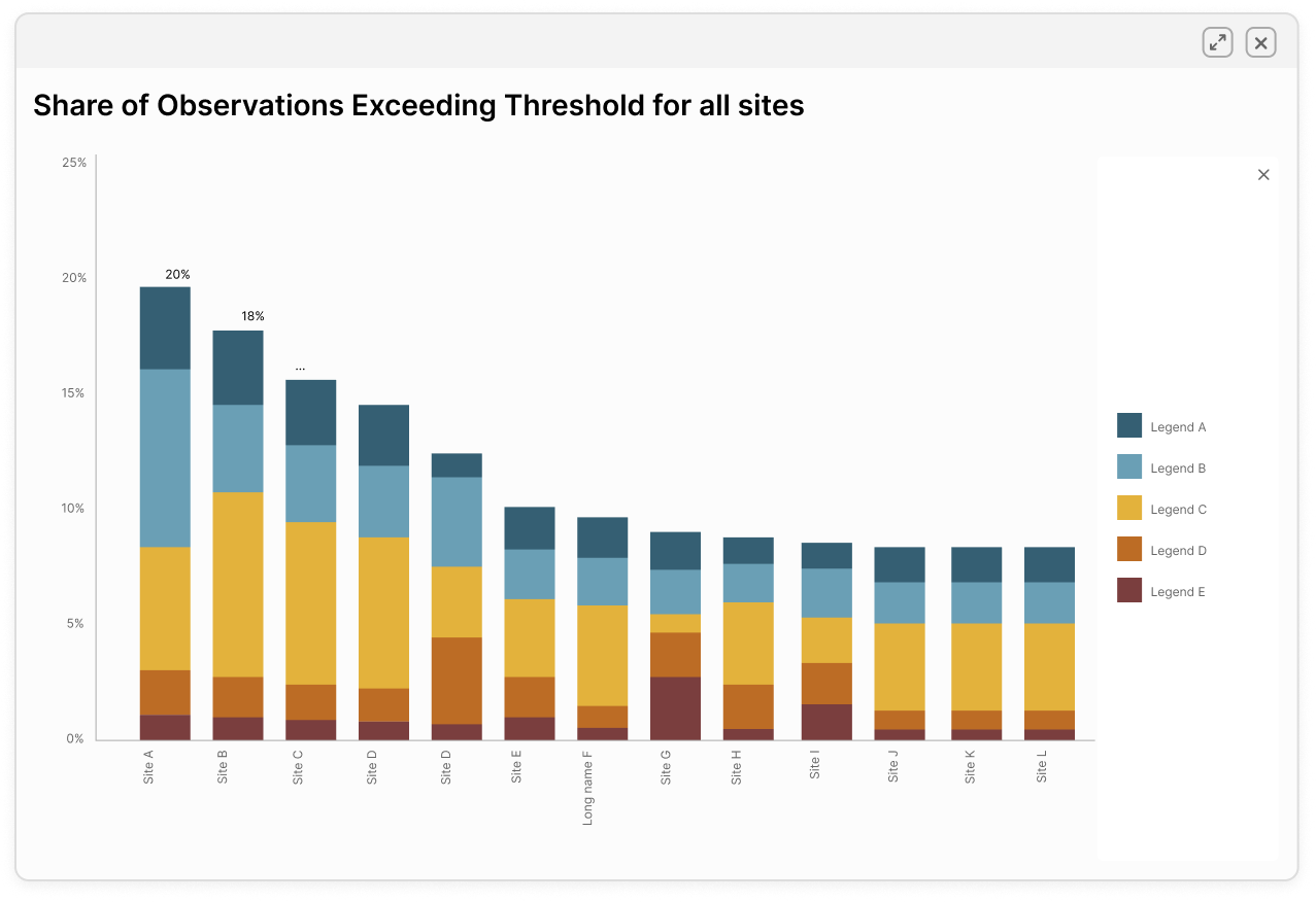
Bar Charts (lower constraint)

  • Position, length, and order provide strong redundancy
  • Legends reinforce sequence and hierarchy
  • Patterns or labels can supplement color

Implication: Color supports comprehension but is rarely the sole carrier of meaning.

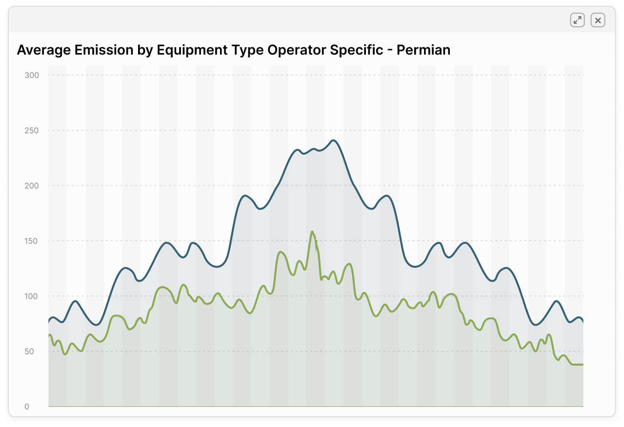
Line Charts (temporal consistency)

  • Multiple entities overlap across time
  • Users rely on color recognition across long time spans
  • Similar hues become difficult to track during intersections or convergence

Implication: Colors must remain recognizable over time and across interactions, not just within a single snapshot.

Accessibility Validation

Accordion Arrow

Accessibility became a concern early when a teammate raised color-blindness risks in dense charts. That shifted how we evaluated the palette from that point forward.

What we evaluated

We reviewed common forms of color-vision deficiency—deuteranopia, protanopia, and tritanopia—and assessed how the palette performed under each condition, particularly in high-density scenarios such as scatter plots and overlapping time-series charts.

Key observations

  • Hue alone was insufficient at higher category counts; some colors collapsed under CVD simulations even when they appeared distinct to non-CVD users.
  • Increasing luminance and saturation separation improved differentiation for color-blind users, but when pushed too far across all 10 categories, it began to reduce readability and balance for the broader user base.
  • Certain combinations (notably blue-green and yellow-green) were more failure-prone, especially under tritanopia and at small mark sizes.

Accessibility trade-off tests

Color-vision deficiency conditions evaluated
Deuteranopia (green-blindness)

Reduced sensitivity to green light. Red and green hues often appear similar, causing green–red and green–brown distinctions to collapse. This is the most common form of color-vision deficiency and a frequent source of issues in red–green categorical palettes.

Protanopia (red-blindness)

Reduced sensitivity to red light. Reds appear darker and can be confused with brown or black, while red–green differentiation is significantly weakened. Contrast issues are often more pronounced than with deuteranopia, especially at smaller sizes.

Tritanopia (blue-blindness)

Reduced sensitivity to blue light. Blue–green and blue–yellow distinctions can break down, and yellow may appear pink or light gray. Although rare, tritanopia is particularly relevant in data visualization because many palettes rely heavily on blue–teal–green ranges.

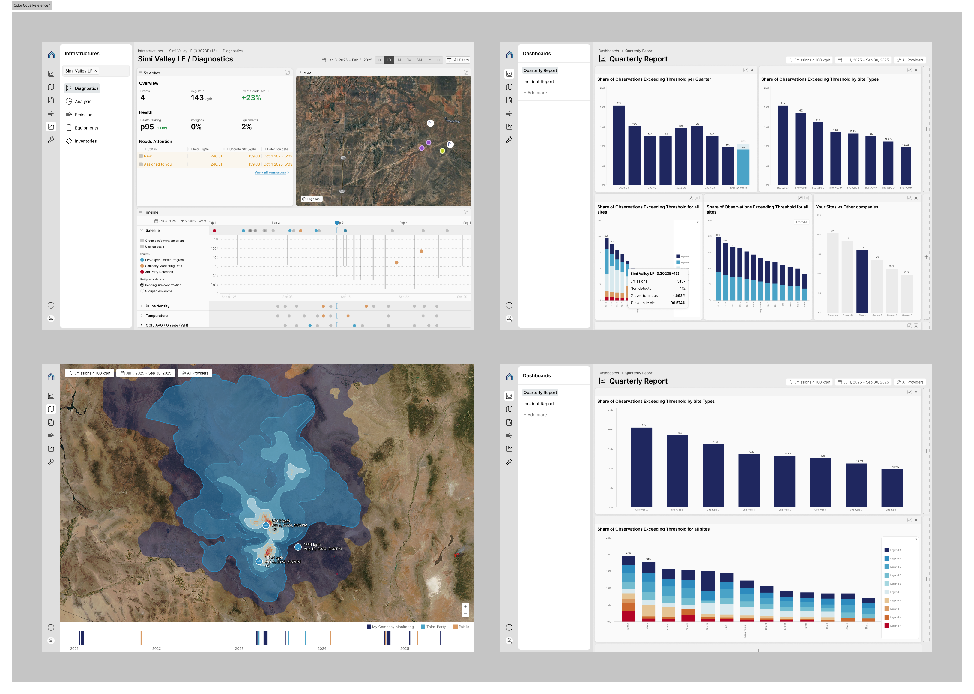
Brightness-driven differentiation
What it does well
  • Strong luminance separation helps mitigate some color-vision deficiencies
  • Categories remain distinguishable even when hue perception collapses
  • Performs better under certain CVD simulations
Where it breaks down
  • Colors appear ordered or sequential, even when the data is categorical
  • Adjacent brightness levels can imply “better vs worse” or “higher vs lower”
  • In stacked bars and grouped views, contiguous tones suggest a gradient that does not exist in the data
Hue-driven differentiation
What it does well
  • More even luminance across categories avoids implied ordering
  • Distinct hues make categories easier to scan for non-CVD users
  • Better supports categorical comparison without suggesting magnitude
Where it breaks down
  • Some hue pairs are less distinguishable under CVD conditions
  • Relies more heavily on hue perception, especially in dense charts

Design decisions

Rather than optimizing a single palette to perfectly serve all conditions—which would have compromised clarity and brand coherence—we made several intentional choices:

  • Prioritized robust differentiation for the primary use cases (dense comparisons at 8–10 categories)
  • Avoided treating any one accessibility scenario as the sole design target
  • Reserved flexibility to support accessibility through alternative color modes and non-color encodings over time

This allowed the core system to remain legible, consistent, and scalable, while acknowledging that accessibility needs vary by context and user.

Figma Workflow & Tooling

Accordion Arrow

Variables with Tokens & Modes

Variables were used to turn the color system into a structured, testable foundation rather than a static palette.

Color palettes were prepared in multiple modes to explore how combinations behaved across different visualization scenarios. These modes allowed the team to compare contrast, hierarchy, and perceptual clarity under realistic data conditions, supporting informed design discussions and final color decisions.

On top of the base palettes, semantic variables were introduced to map color usage to meaning rather than hue. This ensured colors could adapt while preserving intent across charts, states, and datasets.

This approach allowed the team to:

  • test color behavior across multiple visualization contexts
  • guide design conversations with concrete visual comparisons
  • separate visual choice from semantic meaning
  • evolve the palette without breaking established encoding

The goal was not just to define colors, but to create a flexible system that could support changing data, new charts, and future accessibility needs without reworking the foundation.

Components

Components were organized around how visualizations are actually built and interpreted, not by chart type alone.

The system separated:

  • base chart structures
  • color and semantic layers
  • interaction elements (selection, highlight, hover)
  • supporting UI (legends, annotations, tooltips)

This allowed teams to:

  • reuse visual logic across different datas
  • etsmaintain accessibility and contrast rules automatically
  • update encoding decisions without rebuilding charts

The goal was to make correct visualization structure the default, not something designers had to reconstruct each time.

Testing in Figma

Figma was also used as a rapid testing environment to evaluate how the color system behaved under real conditions.I tested:

I tested:

  • dense vs sparse datasets
  • overlapping categories
  • sequential vs diverging data
  • anomaly and highlight scenarios
  • contrast behavior across chart types

Instead of static reviews, these scenarios allowed the team to see how visual encoding held up in practice and identify breakdown points early.

This made design discussions more concrete and helped validate decisions before engineering implementation.

Key Takeaways

Accordion Arrow
Accessibility must be designed into visualization systems—not applied afterward.

Color, contrast, and encoding decisions shape how data is interpreted and trusted, especially in dense analytical environments.

Semantic color systems scale better than fixed palettes.

Separating meaning from hue allowed the system to adapt across datasets, chart types, and evolving requirements without breaking interpretation.

Perception and cognition are core to data design.

Effective visualization depends on how users notice patterns, detect anomalies, and interpret hierarchy—not just on visual clarity.

Tooling determines whether a design system survives.

Tokens, variables, and reusable patterns made the color system operational across teams, not just a one-time design artifact.

Designing for experts requires balancing density with legibility.

Users needed access to complex information quickly, without oversimplifying data or hiding uncertainty.